

Album covers have always been more than a protective sleeve for vinyl or CDs.
They create an identity, set the tone before a single note plays, and often turn into cultural icons themselves.
Some are instantly recognizable worldwide, while others challenge norms and push visual art into bold new directions.
Presented here are ten covers that continue to resonate with fans, critics, and collectors alike.
1. The Beatles – Sgt. Pepper’s Lonely Hearts Club Band
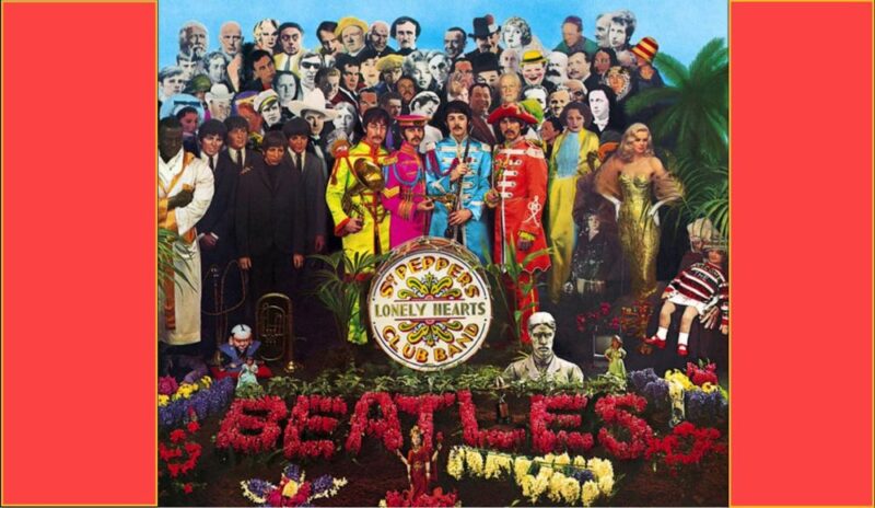
Few covers have changed how music could look as much as this one.
Designed by Peter Blake and Jann Haworth, it placed the The Beatles in front of a collage of historical figures, celebrities, and psychedelic flourishes.
Its bright colors, intricate details, and cultural layering transformed a record sleeve into a visual commentary on fame and society.
Collectors still marvel at its dense symbolism, and generations of fans have treated it as a puzzle waiting to be decoded.
Interestingly, the Rolling Stones attempted to mirror its grandeur with Their Satanic Majesties Request, but the comparison only made Sgt. Pepper’s legacy stronger.
- Year of release: 1967
- Cover artists: Peter Blake and Jann Haworth
- Notable features: Collage of celebrities, surreal color palette, elaborate costumes
- Impact: Redefined album covers as art pieces, inspired imitators across rock
2. Lauryn Hill – The Miseducation of Lauryn Hill

Carved into a wooden school desk, Lauryn Hill’s face emerges as both personal portrait and cultural metaphor.
The design conveys vulnerability, resilience, and reflection on identity. More than just a cover, it visually narrates themes of learning, unlearning, and emotional growth present in the record.
Its understated elegance matched the album’s mix of:
- Hip-hop
- Reggae
- Soul
Similar emotional depth can be achieved in modern portrait work through curated visual environments, like those crafted by Gravity Backdrop, which provide artists with hand-painted textures that enhance the storytelling power of the image.
Fans still view it as a visual emblem of self-expression and empowerment.
- Year of release: 1998
- Cover design: Haze XXL
- Notable features: Wooden desk engraving, portrait of Lauryn Hill, warm brown tones
- Impact: Became symbolic of empowerment and emotional honesty in music
3. Pink Floyd – The Dark Side of the Moon

A simple prism refracting light into a rainbow became a worldwide icon.
Storm Thorgerson and the Hipgnosis design collective crafted a symbol of clarity and mystery at the same time.
No portraits, no flashy typeface, only an elegant geometric design that became synonymous with psychedelic music.
Posters of the cover filled college dorms, and its adaptability for parody or homage turned it into one of the most referenced visuals in music history.
Recognition factor is so high that even those who never listened to Pink Floyd know the prism by sight.
- Year of release: 1973
- Cover design: Storm Thorgerson, Hipgnosis
- Notable features: Black background, prism with refracted rainbow light
- Impact: Became a global visual icon, endlessly referenced in pop culture
4. Sex Pistols – Never Mind the Bollocks…

Nothing screams defiance like neon pink and yellow slapped together with cut-and-paste typography.
Rather than elaborate photography or surreal visuals, this punk manifesto leaned into an almost childish brashness.
No pictures of the band, no carefully staged imagery, just bold letters daring listeners to take offense.
Graphic designer Jamie Reid purposely created something anti-aesthetic, rejecting commercial polish.
Many design historians argue that its crude brilliance reshaped visual communication for music.
Collectors and critics often rank it as one of the purest expressions of punk’s disregard for tradition.
- Year of release: 1977
- Cover artist: Jamie Reid
- Notable features: Neon color scheme, cut-and-paste typography, absence of imagery
- Impact: Embodied punk rejection of polish, influential in graphic design
5. The Velvet Underground & Nico – Banana Cover

Another Warhol creation, this cover became interactive art.
Early vinyl copies featured a banana sticker that could be peeled away, revealing a flesh-colored fruit underneath.
Minimal in composition yet striking in impact, it connected the underground art scene with mainstream music.
The bold simplicity made it stand out in record bins, while the interactive element elevated album packaging into pop art.
Even decades later, the banana remains instantly tied to Lou Reed, Nico, and the edgy experimentation that defined late 60s counterculture.
- Year of release: 1967
- Cover artist: Andy Warhol
- Notable features: Peelable banana sticker, minimal background, bold Pop Art design
- Impact: Icon of avant-garde rock, bridged pop art and music culture
6. The Rolling Stones – Sticky Fingers
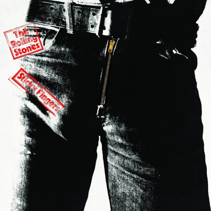
Andy Warhol’s cheeky design created immediate controversy.
A close-up shot of denim-clad hips featured a real working zipper that could be pulled down to reveal cotton briefs underneath. Few covers have embraced rebellion so openly.
It was impractical for record stores, scratching vinyl inside, but that imperfection only added to its myth.
Music critics often describe it as pure rock attitude pressed into twelve inches of cardboard.
Even after the zipper was replaced with a printed version, the idea of tactile, provocative packaging stuck in the minds of fans.
- Year of release: 1971
- Cover artist: Andy Warhol
- Notable features: Working zipper, denim close-up, minimalist text
- Impact: Embodied rock rebellion, memorable for both concept and controversy
7. Nirvana – Nevermind

Few images capture a generational spirit as strongly as a baby swimming after a dollar bill on a hook.
Innocence collides with capitalism in a single frame, symbolizing the raw honesty of grunge and the pressures of modern life. As if it wasn’t enough, this also sparked a lawsuit that ultimately Nirvana won in 2022.
Photographer Kirk Weddle accidentally created one of the most famous rock visuals of all time.
Despite occasional censorship attempts, its power has endured, becoming synonymous with 90s angst and rebellion.
As the record exploded into mainstream culture, so too did the cover’s controversial yet unforgettable imagery.
- Year of release: 1991
- Photographer: Kirk Weddle
- Notable features: Underwater baby, floating dollar bill, stark blue tones
- Cultural impact: Icon of Generation X, symbol of grunge’s raw critique of society
8. The Rolling Stones – Exile on Main St.
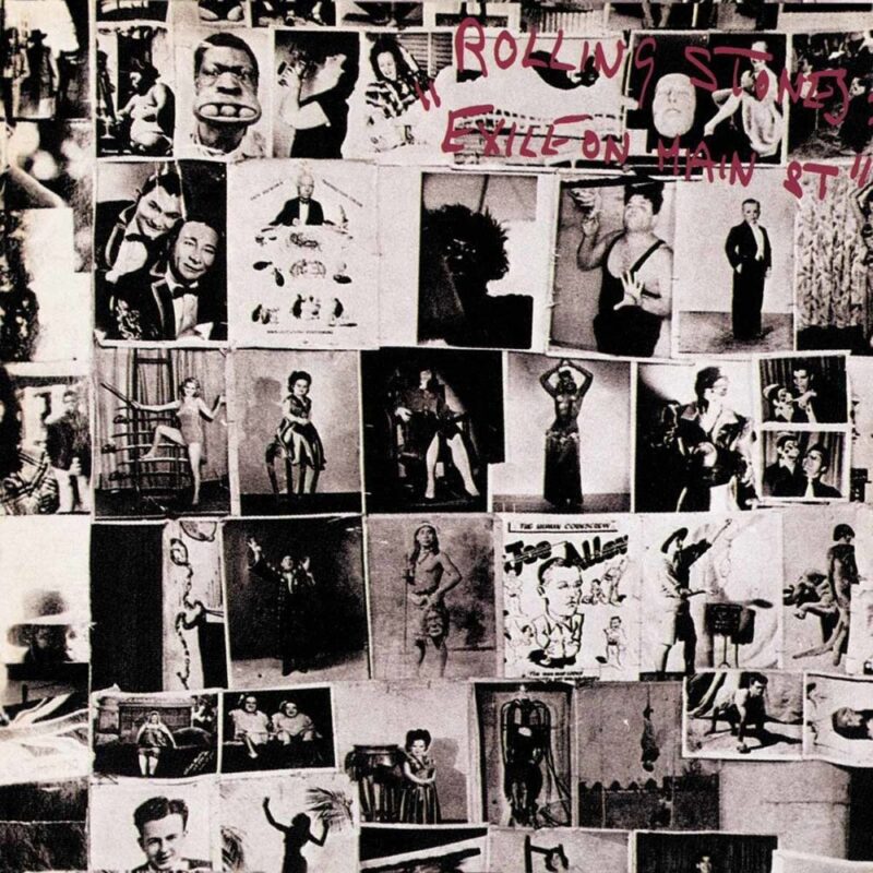
Collaged photographs by Robert Frank, paired with messy typography, give this cover an energy that mirrors the album’s raw blues-rock edge.
It looks chaotic, cluttered, and lived-in, much like the sound within. Critics have described it as a scrapbook of:
- Grit
- Sweat
- Sonic rebellion
Fans often say that the experience of flipping through its details while the record spins amplifies the sense of being immersed in outlaw rock culture.
- Year of release: 1972
- Cover artist: Robert Frank (photography), John Van Hamersveld (design)
- Notable features: Collage of circus performers, vintage photos, rough typography
- Impact: Captured the chaotic essence of Stones’ raw sound and lifestyle
9. The Rolling Stones – Tattoo You
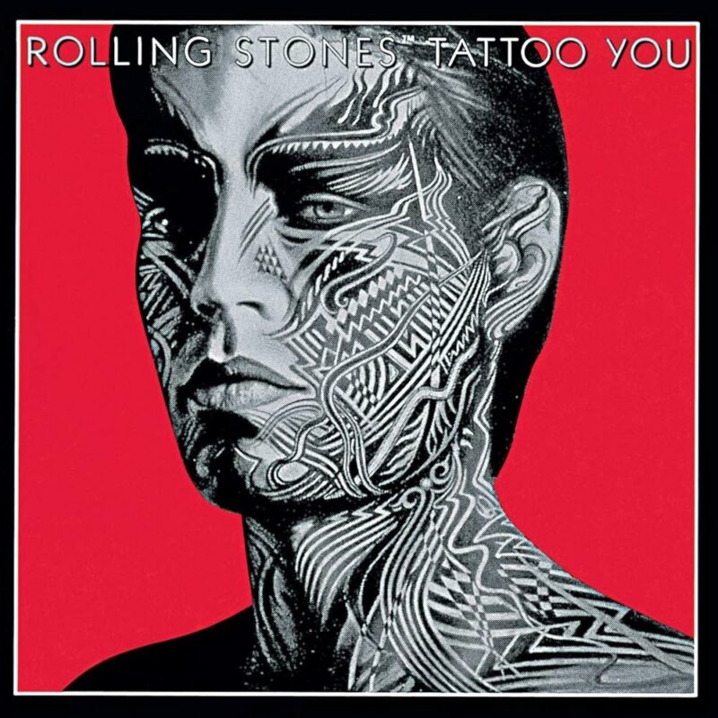
A sharp portrait of Mick Jagger’s face covered in tattoo-like designs captures the sleek yet defiant energy of the early 80s.
Art director Peter Corriston created a balance between:
- Bold color
- Geometric layout
- Striking close-up
The combination of photography and graphic elements produced one of the band’s most visually memorable releases.
Many critics consider it among the Stones’ strongest design efforts, as impactful as the music itself. Even decades later, the cover’s bold simplicity feels modern.
- Year of release: 1981
- Art direction: Peter Corriston
- Notable features: Jagger portrait, stylized tattoo graphics, bold red background
- Impact: Recognized as one of the Stones’ most visually powerful covers
10. Joni Mitchell – Hejira
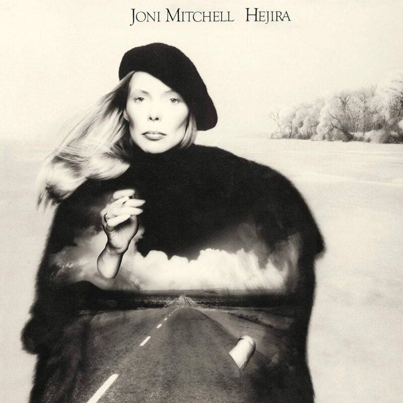
A poetic fusion of photography and airbrush shows Joni Mitchell fading into a snowy road. It reflects themes of solitude, movement, and reflection.
The haunting image connects directly to the album’s lyrical focus on wandering and emotional discovery.
Mitchell herself praised it as one of her favorites, suggesting how closely it aligned with her artistic vision.
Unlike flashier designs of the era, its quiet subtlety allows space for interpretation, creating resonance that grows stronger over time.
- Year of release: 1976
- Cover artist: Designed by Mitchell with photographer Joel Bernstein
- Notable features: Blended photo and airbrush effect, road imagery, haunting tone
- Impact: Considered one of Mitchell’s most personal and introspective visuals
The Bottom Line
Album covers are not just accessories for records; they shape memory, culture, and identity.
Collectors, designers, and fans continue to analyze them not only for their aesthetic impact but also for the stories they tell about society and creativity.
What sits on the outside can be just as iconic as the songs inside, proving that music history lives through sight as much as through sound.